Prototype photos
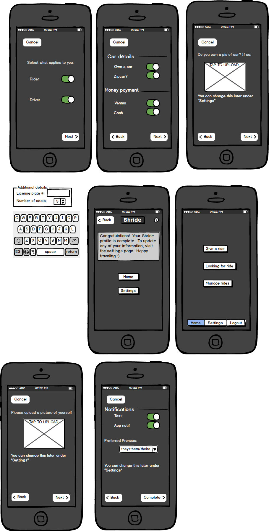
Create profile:
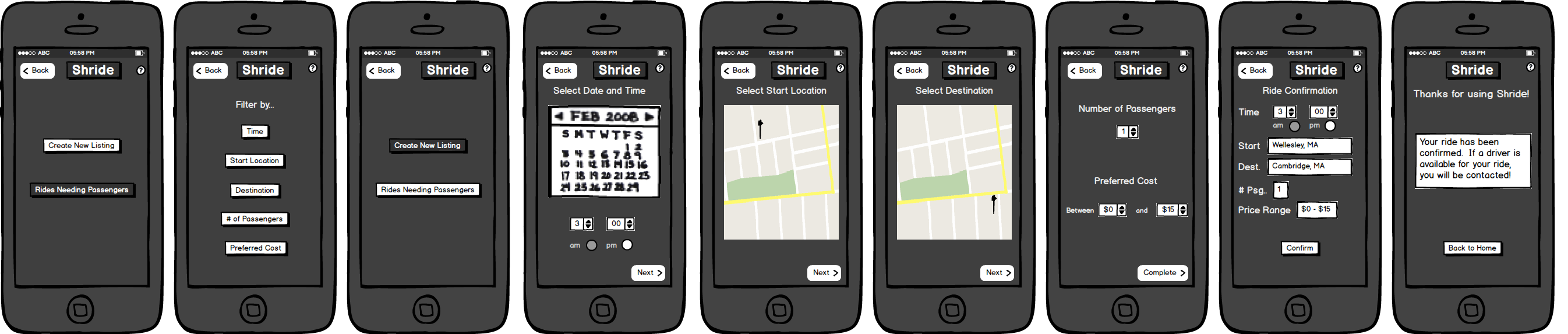
Join a ride [as a rider]
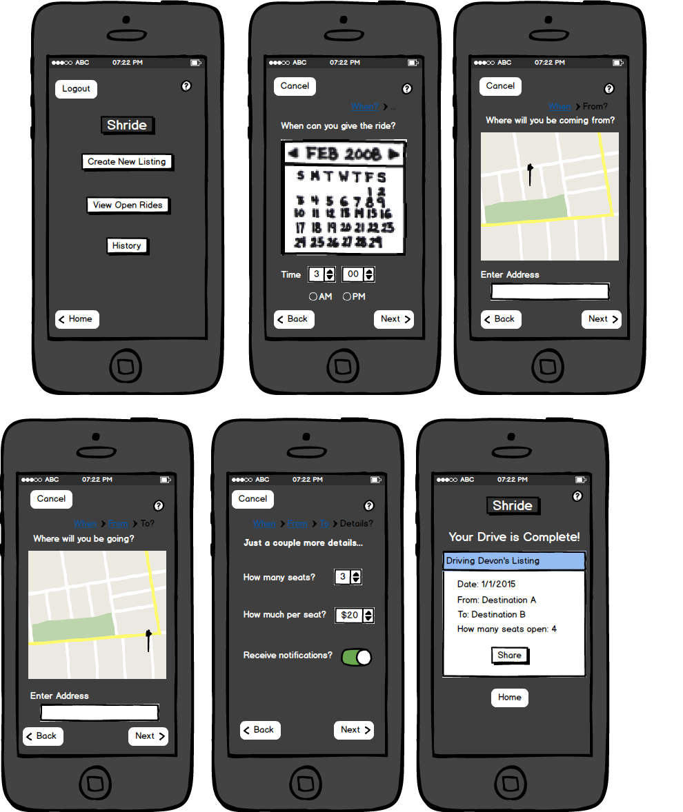
Create a ride [as a driver]
Prepare a briefing for test users. This should be at most a page of information about the purpose of your application and any background information about the domain that may be needed by your test users to understand it. Make your briefing short, clear and concise, it should not describe how to use the interface.
Shride is a rideshare application that focuses on the internal community as a resource for transportation. Travelling by car can be difficult to finagle at Wellesley-- you can find rides on facebook, email, and spreadsheets, but it is altogether too chaotic to navigate. The goal in mind with Shride is to centralize the “need ride” messages sent out on public forums into one location and simplify the process of finding student drivers (who will likely charge less than a taxi service or nationwide rideshare application user). We also hope to provide a safer and more comfortable experience to users as all interactions are between Wellesley students. Inspired by Uber and Carma Carpool, we hope to change the way student transportation is run, both to reduce our carbon footprint and create a more tight knit community.
Write your 3 scenario tasks on separate index cards. Just write the concrete goals of the task (e.g. "use this mobile app to buy milk, tomatoes, and bread"). Don't write the specific steps to follow, since that's for your users to figure out.
- Create a profile
- Join a ride (as a rider)
- Make a ride (as a driver)
Filmed task: Create a profile
Observations: Usability problems you discovered from the testing. Describe what users did, but don't record users' names. Your observations should include both your pilot users, and at least 3 users from outside the class.
Our users in class:
Our users in class noticed a lot of transition details and inquired about mostly third party app integration.
- We didn’t have a sign in button.
- We had redundant fields in the “Create Profile” task
- Redundancy in terms of contact information attained from the Wellesley Login and filled in during the “Create Profile” task
- Accessing photos permissions alert
- Contact button should be a share button for the “Make a drive”
- Breadcrumbs are unnecessary and clutter screen
- Easy reversal of action needed to be streamlined for “Join a ride” and “Create a Profile”
- More specific information about the driver for riders to see when they join rides
Our users outside of class:
- Keeping our menu bar constant across all tasks (whether to log out or to cancel or to have a menu bar at all)
- Add rate and cost information for riders when they join rides
- Adding field for text input of address so that you don’t need to find it on the map
Prototype iteration: Describe how your prototype changed between your pilot users and the real users.
Slideshow
How it changed
Breaking it up: We changed the “Create Profile” task to be a longer process with shorter fields for each step so that the user wouldn’t have to be overwhelmed with fields.
Simplifying the action: we wanted users to feel like they were in control (adding “Back” and “Next” buttons to control action within the app).
Creating more paths: Added car information component to the driver profile, which only shows up if you are driver.
Resolutions: What did you learn about the parts of your interface from this prototype? Propose design solutions for the usability problems you found.
Users found it easier to be guided through forms rather than having a form on one page.
Users within class enjoyed more visual map based location identification while users outside of class wanted to have text fields to be more specific
Users in class were surprised that tasks could be accomplished quickly-- breaking up information into bite-sized pieces helps with making actions seem like they go by more quickly
Our design solution is to make sure that we are keeping elements very basic from page to page. Making sure we stay consistent with our menus and stay consistent with the amount of whitespace from page to page is crucial to making the app usable.